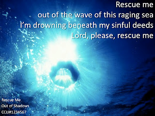
 As churches are moving toward a more contemporary set up, it can be difficult to decide what mediums to use for projected graphics. While Easy Worship and Media Shout have pioneered a new direction for their users, many churches are suffering at the mercy of Microsoft Power Point. There are a lot of limitations, but it is possible to create visually pleasing graphics for the purpose of leading music, and illustrating your sermon. Here are a few tips that I have learned over the years by doing it myself and watching other people use it.
1. Select an attractive background that represents the mood of the song or Scripture. You will have to venture out of the stock photos/backgrounds you get with Power Point. One of the most helpful websites I have used over the years is http://www.sxc.hu. There is a plethora of free photos you can use. You want a picture with dark colors that are not busy.
2. Use at least 40 point type. This is important so that everyone can read the words from anywhere in the room. This typically works for congregations sizes 1 to 500 people.
3. In my experience, white is the best color to use for your font. Also use the "Image Shading" function to cast an attractive shadow behind the font that you can make darker or lighter as you see fit. To do this simply select the text box (do not highlight the text) and use the shading function in your Formatting Pallete. This will make your words stand out more clearly from the background.
4. Use Scripture that goes with the song during any musical solos, or leading into or out of a song.
5. Be sure to put the CCLI information on each slide. If you are not familiar with this, click here for more info.
Hope this helps and happy Power Pointing!